
96+ Content UI Blocks based on shadcn/ui
96 blocks across 11 categories · free and PRO · React, Next.js, Tailwind CSS
Present content beautifully with shadcn/ui content and editorial blocks: magazine-grade editorial layouts, blog grids and article cards, feature sections, FAQ accordions, stats displays, calendars and schedulers, logo strips, plus polished error (404/500) and maintenance pages. All blocks are React + TypeScript on shadcn/ui primitives with Tailwind CSS.
From a documentation FAQ to a print-inspired editorial spread, each block focuses on typography, spacing, and hierarchy, copy the code or install with one CLI command and adapt it to your brand.
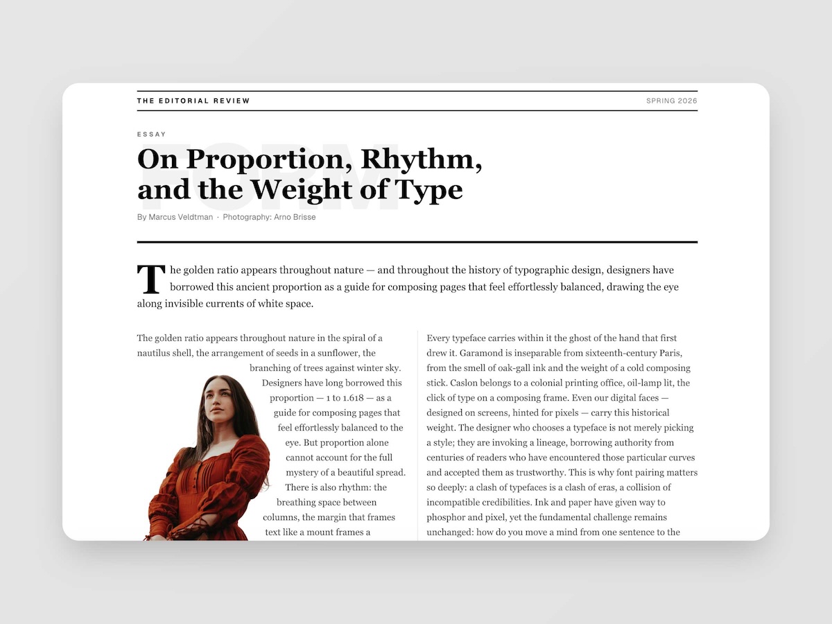
Editorial
5 Blocks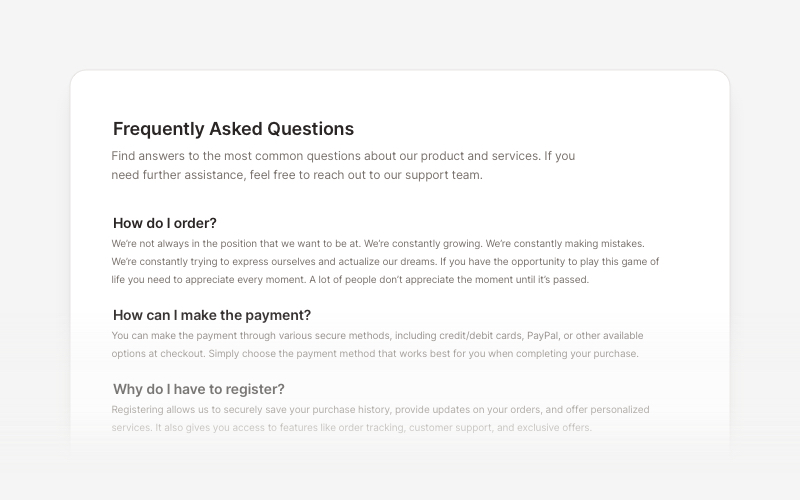
FAQs
8 Blocks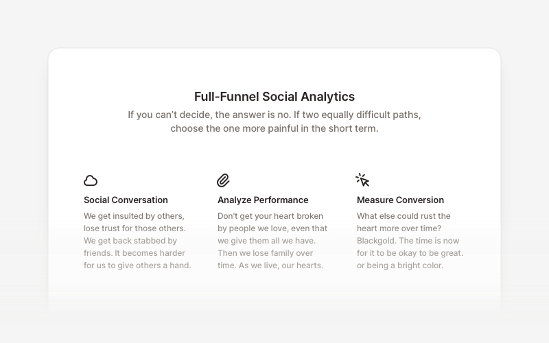
Feature
20 Blocks
Stats
11 Blocks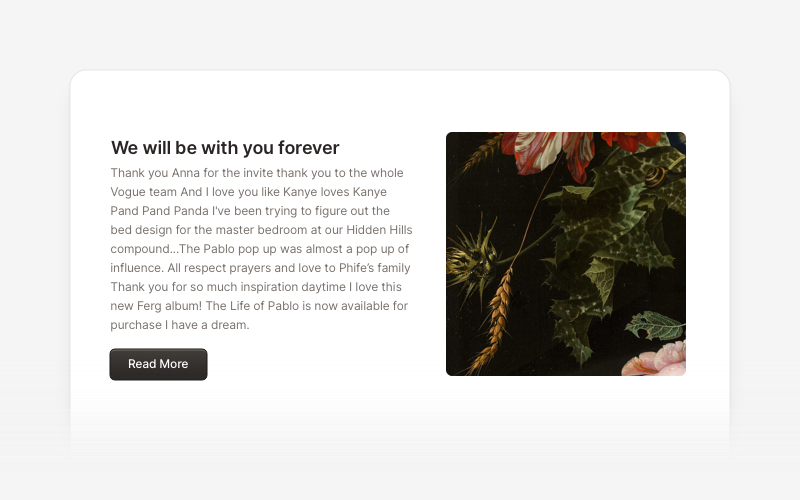
Content
20 Blocks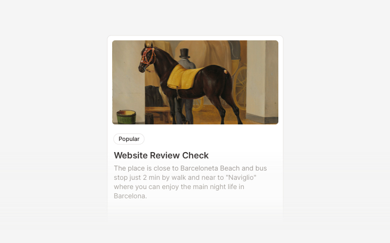
Card
5 Blocks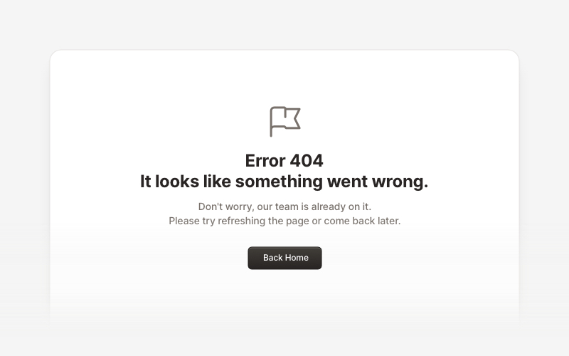
Error
7 Blocks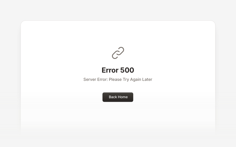
Maintenance
4 Blocks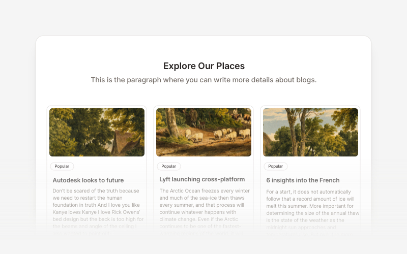
Blog
6 Blocks
Logo
7 Blocks
Calendar
3 BlocksFrequently asked questions
What kinds of content blocks are in this collection?
Editorial and magazine-style layouts, blog lists and cards, feature sections, FAQ components, stats sections, calendars, logo showcases, and ready-made 404, 500, and maintenance pages.
What makes the editorial blocks different from blog blocks?
Editorial blocks bring print-style art direction to React, multi-column spreads, drop caps, pull quotes, and oversized typographic anchors, while blog blocks focus on article grids, previews, and post layouts.
How do I install a content block?
Run npx @creative-tim/ui@latest add <block-name>, or use the shadcn CLI with the block's registry URL: npx shadcn@latest add https://www.creative-tim.com/ui/r/<block-name>.json.
Can I use the error and maintenance pages as full routes?
Yes. The 404, 500, and maintenance blocks ship as full-page layouts you can drop into a Next.js not-found or error route, or any router's fallback page.
Do the blocks follow my existing shadcn/ui theme?
Yes. Every block uses shadcn/ui theme tokens for colors, radius, and typography, so it matches your design system and supports dark mode automatically.
Are the content blocks free?
Many are free and open source; PRO blocks install identically with a Creative Tim API key from creative-tim.com/ui.