

"use client"

import { Calendar, Heart, ShoppingCart, Star } from "lucide-react"

import { Button } from "@/components/ui/button"
import {
  Card,
  CardContent,
  CardDescription,
  CardFooter,
  CardHeader,
  CardTitle,
} from "@/components/ui/card"

export function CardDemo() {
  return (
    <div className="grid w-full">
      {/* Blog Card */}
      <Card className="overflow-hidden pt-0">
        <div className="aspect-video w-full">
          <img
            className="h-full w-full object-cover"
            src="https://images.unsplash.com/photo-1617800161096-81981e027982?q=80&w=500&auto=format&fit=crop"
            alt="Blog 1"
          />
        </div>
        <CardContent className="flex flex-col gap-2">
          <div className="text-muted-foreground flex items-center gap-2 text-xs">
            <Calendar className="h-3 w-3" />
            <span>Mar 15, 2025</span>
            <span>•</span>
            <span>5 min read</span>
          </div>
          <CardTitle className="text-xl font-semibold">
            The Future of AI
          </CardTitle>
          <CardDescription className="line-clamp-2">
            AI is changing the world and will continue to do so in the future.
            Check Creative Tim UI for more information.
          </CardDescription>
        </CardContent>
        <CardFooter>
          <Button variant="secondary" size="sm">
            Read More
          </Button>
        </CardFooter>
      </Card>
    </div>
  )
}
The card is one of those components you'll use on almost every page — a product tile, a blog preview, a pricing plan, a login form. They all share the same job: take a chunk of related content and make it read as one block.
What's below is the shadcn/ui Card with Material Tailwind styling on top, and 15+ layouts we've already built out. Find the one closest to what you're after, copy it, and change the parts you need. The only setup is the install command.
Installation
Usage
import {
Card,
CardContent,
CardDescription,
CardFooter,
CardHeader,
CardTitle,
} from "@/components/ui/card"Examples
Card Plain
A simple card with just content.
This is a plain card with simple content. Perfect for displaying basic information.
"use client"

import { Card, CardContent } from "@/components/ui/card"

export function CardPlain() {
  return (
    <Card className="w-full max-w-md">
      <CardContent className="pt-6">
        <p className="text-muted-foreground text-sm">
          This is a plain card with simple content. Perfect for displaying basic
          information.
        </p>
      </CardContent>
    </Card>
  )
}
<Card>
<CardContent className="pt-6">
<p>
This is a plain card with simple content. Perfect for displaying basic
information.
</p>
</CardContent>
</Card>Card with Title, Description, and Button
A card with header elements and a call-to-action button.
More detailed information goes here in the card content area.
"use client"

import { Button } from "@/components/ui/button"
import {
  Card,
  CardContent,
  CardDescription,
  CardFooter,
  CardHeader,
  CardTitle,
} from "@/components/ui/card"

export function CardWithButton() {
  return (
    <Card className="w-full max-w-md">
      <CardHeader>
        <CardTitle>Card Title</CardTitle>
        <CardDescription>
          This is a brief description of the card content.
        </CardDescription>
      </CardHeader>
      <CardContent>
        <p className="text-muted-foreground text-sm">
          More detailed information goes here in the card content area.
        </p>
      </CardContent>
      <CardFooter>
        <Button>Learn More</Button>
      </CardFooter>
    </Card>
  )
}
<Card>
<CardHeader>
<CardTitle>Card Title</CardTitle>
<CardDescription>
This is a brief description of the card content.
</CardDescription>
</CardHeader>
<CardContent>
<p>More detailed information goes here in the card content area.</p>
</CardContent>
<CardFooter>
<Button>Get Started</Button>
</CardFooter>
</Card>Card Blog
A card designed for blog post previews with image, title, excerpt, and metadata.
"use client"

import { Calendar } from "lucide-react"

import { Button } from "@/components/ui/button"
import {
  Card,
  CardDescription,
  CardFooter,
  CardHeader,
  CardTitle,
} from "@/components/ui/card"

export function CardBlog() {
  return (
    <Card className="w-full max-w-md overflow-hidden">
      <div className="aspect-video w-full bg-gradient-to-br from-blue-500 to-purple-600" />
      <CardHeader>
        <div className="text-muted-foreground flex items-center gap-2 text-sm">
          <Calendar className="h-4 w-4" />
          <span>March 15, 2025</span>
          <span>•</span>
          <span>5 min read</span>
        </div>
        <CardTitle>Getting Started with Next.js</CardTitle>
        <CardDescription>
          Learn how to build modern web applications with Next.js, React, and
          TypeScript.
        </CardDescription>
      </CardHeader>
      <CardFooter>
        <Button variant="ghost">Read More</Button>
      </CardFooter>
    </Card>
  )
}
<Card className="overflow-hidden">
<img
src="/blog-image.jpg"
alt="Blog post"
className="h-48 w-full object-cover"
/>
<CardHeader>
<div className="text-muted-foreground flex items-center gap-2 text-sm">
<Calendar className="h-4 w-4" />
<span>March 15, 2025</span>
<span>•</span>
<span>5 min read</span>
</div>
<CardTitle>Getting Started with Next.js</CardTitle>
<CardDescription>
Learn how to build modern web applications with Next.js, React, and
TypeScript.
</CardDescription>
</CardHeader>
<CardFooter>
<Button variant="ghost">Read More</Button>
</CardFooter>
</Card>Card E-commerce Product
A card designed for product listings with image, pricing, and add to cart functionality.
"use client"

import { Heart, ShoppingCart, Star } from "lucide-react"

import { Badge } from "@/components/ui/badge"
import { Button } from "@/components/ui/button"
import {
  Card,
  CardContent,
  CardDescription,
  CardFooter,
  CardHeader,
  CardTitle,
} from "@/components/ui/card"

export function CardEcommerce() {
  return (
    <Card className="w-full max-w-sm overflow-hidden">
      <div className="relative">
        <div className="aspect-video w-full bg-gradient-to-br from-amber-400 to-orange-500" />
        <Badge className="absolute top-2 right-2">New</Badge>
      </div>
      <CardHeader>
        <CardTitle>Premium Wireless Headphones</CardTitle>
        <CardDescription>
          High-quality audio with active noise cancellation
        </CardDescription>
      </CardHeader>
      <CardContent>
        <div className="flex items-center justify-between">
          <div className="flex items-center gap-1">
            {[...Array(4)].map((_, i) => (
              <Star
                key={i}
                className="h-4 w-4 fill-yellow-400 text-yellow-400"
              />
            ))}
            <Star className="h-4 w-4" />
            <span className="text-muted-foreground text-sm">(128)</span>
          </div>
          <div className="text-2xl font-bold">$299</div>
        </div>
      </CardContent>
      <CardFooter className="gap-2">
        <Button className="flex-1">
          <ShoppingCart className="mr-2 h-4 w-4" />
          Add to Cart
        </Button>
        <Button variant="outline" size="icon">
          <Heart className="h-4 w-4" />
        </Button>
      </CardFooter>
    </Card>
  )
}
<Card className="overflow-hidden">
<div className="relative">
<img
src="/product-image.jpg"
alt="Product"
className="h-64 w-full object-cover"
/>
<Badge className="absolute top-2 right-2">New</Badge>
</div>
<CardHeader>
<CardTitle>Premium Wireless Headphones</CardTitle>
<CardDescription>
High-quality audio with active noise cancellation
</CardDescription>
</CardHeader>
<CardContent>
<div className="flex items-center justify-between">
<div className="flex items-center gap-1">
<Star className="h-4 w-4 fill-yellow-400 text-yellow-400" />
<Star className="h-4 w-4 fill-yellow-400 text-yellow-400" />
<Star className="h-4 w-4 fill-yellow-400 text-yellow-400" />
<Star className="h-4 w-4 fill-yellow-400 text-yellow-400" />
<Star className="h-4 w-4" />
<span className="text-muted-foreground text-sm">(128)</span>
</div>
<div className="text-2xl font-bold">$299</div>
</div>
</CardContent>
<CardFooter className="gap-2">
<Button className="flex-1">
<ShoppingCart className="mr-2 h-4 w-4" />
Add to Cart
</Button>
<Button variant="outline" size="icon">
<Heart className="h-4 w-4" />
</Button>
</CardFooter>
</Card>Card Simple
A basic card with title, description, and a call-to-action button.
The place is close to Barceloneta Beach and bus stop just 2 min by walk and near to "Naviglio" where you can enjoy the main night life in Barcelona.
"use client"

import { Button } from "@/components/ui/button"
import {
  Card,
  CardContent,
  CardDescription,
  CardFooter,
  CardHeader,
  CardTitle,
} from "@/components/ui/card"

export function CardSimple() {
  return (
    <Card className="w-full max-w-xs">
      <CardHeader>
        <CardTitle>UI/UX Review Check</CardTitle>
      </CardHeader>
      <CardContent>
        <p className="text-muted-foreground text-sm">
          The place is close to Barceloneta Beach and bus stop just 2 min by
          walk and near to "Naviglio" where you can enjoy the main night life in
          Barcelona.
        </p>
      </CardContent>
      <CardFooter>
        <Button className="w-full">Read More</Button>
      </CardFooter>
    </Card>
  )
}
Card with Image
A card featuring an image header with title and description.
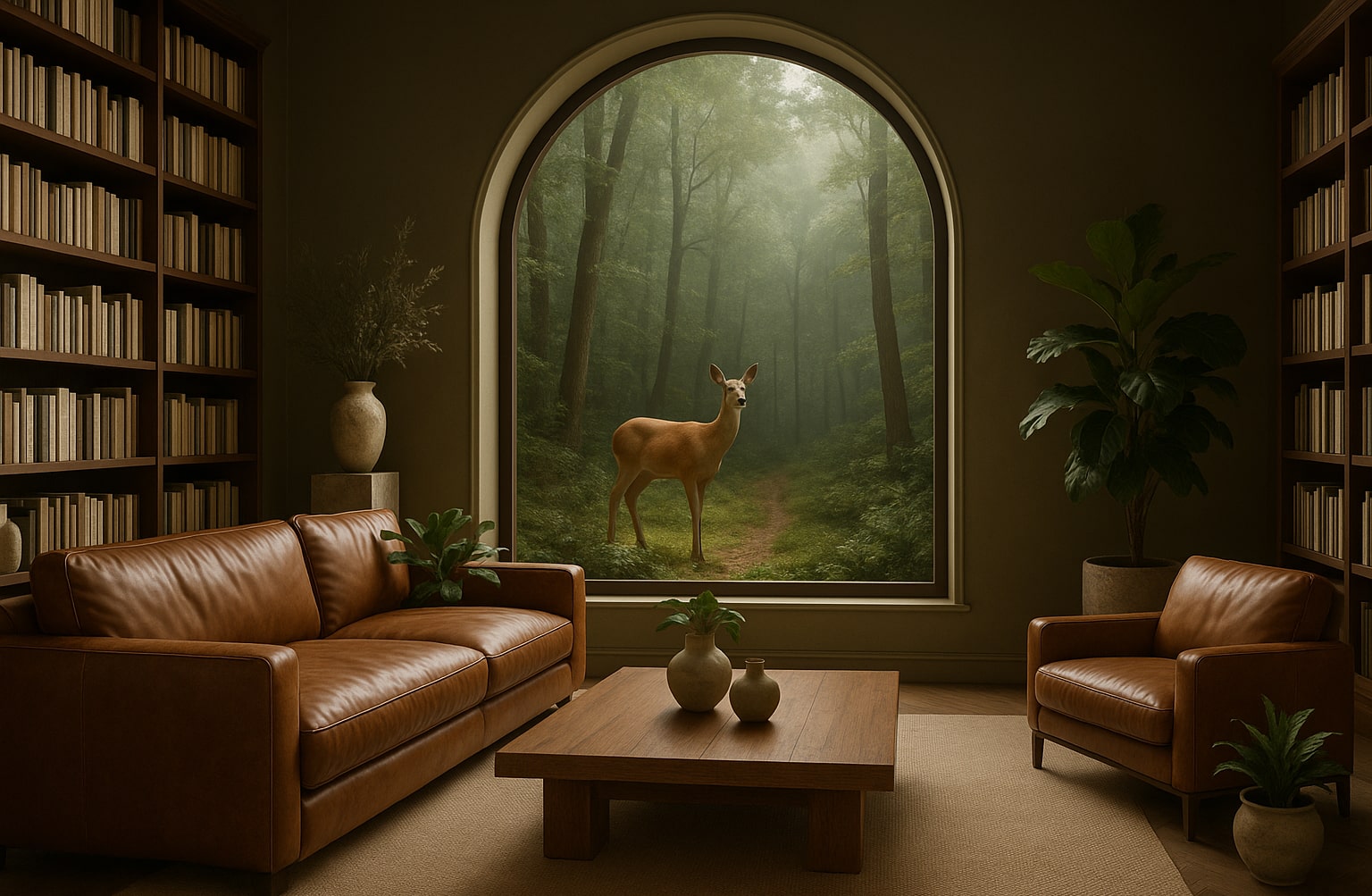
The place is close to Barceloneta Beach and bus stop just 2 min by walk and near to "Naviglio" where you can enjoy the main night life in Barcelona.
"use client"

import { Button } from "@/components/ui/button"
import {
  Card,
  CardContent,
  CardFooter,
  CardHeader,
  CardTitle,
} from "@/components/ui/card"

export function CardWithImage() {
  return (
    <Card className="w-full max-w-xs overflow-hidden pt-0">
      <img
        src="https://raw.githubusercontent.com/creativetimofficial/public-assets/refs/heads/master/creative-ai/bg-2.jpg"
        alt="UI/UX Review"
        className="h-48 w-full object-cover"
      />
      <CardHeader>
        <CardTitle>UI/UX Review Check</CardTitle>
      </CardHeader>
      <CardContent>
        <p className="text-muted-foreground text-sm">
          The place is close to Barceloneta Beach and bus stop just 2 min by
          walk and near to "Naviglio" where you can enjoy the main night life in
          Barcelona.
        </p>
      </CardContent>
      <CardFooter>
        <Button>Read More</Button>
      </CardFooter>
    </Card>
  )
}
Card Profile
A card designed for user profiles with avatar, name, title, and social media links.

CEO & Co-Founder
"use client"

import { Facebook, Instagram, Twitter } from "lucide-react"

import { Button } from "@/components/ui/button"
import {
  Card,
  CardContent,
  CardFooter,
  CardHeader,
  CardTitle,
} from "@/components/ui/card"
import {
  Tooltip,
  TooltipContent,
  TooltipProvider,
  TooltipTrigger,
} from "@/components/ui/tooltip"

export function CardProfile() {
  return (
    <Card className="w-full max-w-xs overflow-hidden pt-0">
      <img
        src="https://images.unsplash.com/photo-1750223642533-1b74b17edae8?auto=format&fit=crop&q=80&w=400&h=400"
        alt="Alex Andrew"
        className="h-48 w-full object-cover"
      />
      <CardHeader className="text-center">
        <CardTitle>Alex Andrew</CardTitle>
        <p className="text-muted-foreground text-sm">CEO & Co-Founder</p>
      </CardHeader>
      <CardFooter className="flex items-center justify-center gap-1">
        <TooltipProvider>
          <Tooltip>
            <TooltipTrigger asChild>
              <Button variant="ghost" size="icon">
                <Twitter className="h-4 w-4" />
              </Button>
            </TooltipTrigger>
            <TooltipContent>
              <p>Follow</p>
            </TooltipContent>
          </Tooltip>
          <Tooltip>
            <TooltipTrigger asChild>
              <Button variant="ghost" size="icon">
                <Facebook className="h-4 w-4" />
              </Button>
            </TooltipTrigger>
            <TooltipContent>
              <p>Like</p>
            </TooltipContent>
          </Tooltip>
          <Tooltip>
            <TooltipTrigger asChild>
              <Button variant="ghost" size="icon">
                <Instagram className="h-4 w-4" />
              </Button>
            </TooltipTrigger>
            <TooltipContent>
              <p>Follow</p>
            </TooltipContent>
          </Tooltip>
        </TooltipProvider>
      </CardFooter>
    </Card>
  )
}
Card Pricing
A pricing card with highlighted features, pricing information, and a call-to-action button.
5 team members
200+ components
40+ built-in pages
1 year free updates
Life time technical support
"use client"

import { Check } from "lucide-react"

import { Badge } from "@/components/ui/badge"
import { Button } from "@/components/ui/button"
import { Card, CardContent, CardFooter, CardHeader } from "@/components/ui/card"
import { Separator } from "@/components/ui/separator"

export function CardPricing() {
  return (
    <Card className="bg-primary text-primary-foreground w-full max-w-xs">
      <CardHeader className="py-6 text-center">
        <Badge variant="secondary" className="mx-auto w-fit">
          Standard
        </Badge>
        <div className="mt-3 flex items-baseline justify-center gap-1">
          <span className="text-4xl">$</span>
          <span className="text-7xl font-bold">29</span>
          <span className="text-4xl">/mo</span>
        </div>
      </CardHeader>
      <Separator className="bg-primary-foreground/20" />
      <CardContent className="space-y-3 px-8 pt-8 pb-6">
        <div className="flex items-center gap-4 text-white">
          <Check className="h-5 w-5" />
          <p className="text-sm">5 team members</p>
        </div>
        <div className="flex items-center gap-4 text-white">
          <Check className="h-5 w-5" />
          <p className="text-sm">200+ components</p>
        </div>
        <div className="flex items-center gap-4 text-white">
          <Check className="h-5 w-5" />
          <p className="text-sm">40+ built-in pages</p>
        </div>
        <div className="flex items-center gap-4 text-white">
          <Check className="h-5 w-5" />
          <p className="text-sm">1 year free updates</p>
        </div>
        <div className="flex items-center gap-4 text-white">
          <Check className="h-5 w-5" />
          <p className="text-sm">Life time technical support</p>
        </div>
      </CardContent>
      <CardFooter>
        <Button
          className="w-full border-white bg-white text-black hover:bg-white/90 hover:text-black"
          variant="outline"
        >
          Buy Now
        </Button>
      </CardFooter>
    </Card>
  )
}
Card Login
A card designed for user authentication with email and password inputs.
"use client"

import { Button } from "@/components/ui/button"
import {
  Card,
  CardContent,
  CardFooter,
  CardHeader,
  CardTitle,
} from "@/components/ui/card"
import { Checkbox } from "@/components/ui/checkbox"
import { Input } from "@/components/ui/input"
import { Label } from "@/components/ui/label"

export function CardLogin() {
  return (
    <Card className="w-full max-w-xs pt-0">
      <CardHeader className="bg-primary text-primary-foreground rounded-t-lg py-6">
        <CardTitle className="text-center text-2xl font-bold">
          Sign In
        </CardTitle>
      </CardHeader>
      <CardContent className="space-y-4 pt-6">
        <div className="space-y-2">
          <Label htmlFor="email" className="text-sm font-semibold">
            Email
          </Label>
          <Input id="email" type="email" placeholder="[email protected]" />
        </div>
        <div className="space-y-2">
          <Label htmlFor="password" className="text-sm font-semibold">
            Password
          </Label>
          <Input id="password" type="password" placeholder="************" />
        </div>
        <div className="flex items-center space-x-2">
          <Checkbox id="remember" />
          <Label htmlFor="remember" className="text-muted-foreground text-sm">
            Remember Me
          </Label>
        </div>
        <Button className="w-full">Sign In</Button>
      </CardContent>
      <CardFooter className="text-center">
        <p className="text-muted-foreground flex items-center justify-center gap-1 text-sm">
          Don't have an account?
          <a href="#" className="text-primary font-bold">
            Sign up
          </a>
        </p>
      </CardFooter>
    </Card>
  )
}
Card Horizontal
A horizontally oriented card with image on the side and content area.

startups
Like so many organizations these days, Autodesk is a company in transition. It was until recently a traditional boxed software company selling licenses. Yet its own business model disruption is only part of the story
"use client"

import { ArrowRight } from "lucide-react"

import { Button } from "@/components/ui/button"
import { Card, CardContent, CardTitle } from "@/components/ui/card"

export function CardHorizontal() {
  return (
    <Card className="flex w-full max-w-[48rem] flex-row overflow-hidden py-0">
      <div className="w-2/5 shrink-0">
        <img
          src="https://raw.githubusercontent.com/creativetimofficial/public-assets/refs/heads/master/creative-ai/bg-3.jpg"
          alt="Startups"
          className="h-full w-full object-cover"
        />
      </div>
      <CardContent className="flex flex-col justify-center p-6">
        <p className="text-muted-foreground mb-4 text-xs font-bold uppercase">
          startups
        </p>
        <CardTitle className="mb-2 text-xl">
          Lyft launching cross-platform service this week
        </CardTitle>
        <p className="text-muted-foreground mb-8 text-sm">
          Like so many organizations these days, Autodesk is a company in
          transition. It was until recently a traditional boxed software company
          selling licenses. Yet its own business model disruption is only part
          of the story
        </p>
        <Button variant="default" className="flex w-fit items-center gap-2">
          Learn More
          <ArrowRight className="h-4 w-4" />
        </Button>
      </CardContent>
    </Card>
  )
}
Card Booking
A detailed booking card with image, rating, amenities, and reservation functionality.

Enter a freshly updated and thoughtfully furnished peaceful home surrounded by ancient trees, stone walls, and open meadows.
"use client"

import { DollarSign, Flame, Heart, Home, Star, Tv, Wifi } from "lucide-react"

import { Button } from "@/components/ui/button"
import {
  Card,
  CardContent,
  CardFooter,
  CardHeader,
  CardTitle,
} from "@/components/ui/card"
import {
  Tooltip,
  TooltipContent,
  TooltipProvider,
  TooltipTrigger,
} from "@/components/ui/tooltip"

export function CardBooking() {
  return (
    <Card className="w-full max-w-[26rem] overflow-hidden shadow-lg">
      <div className="relative">
        <img
          src="https://images.unsplash.com/photo-1499696010180-025ef6e1a8f9?ixlib=rb-4.0.3&ixid=MnwxMjA3fDB8MHxwaG90by1wYWdlfHx8fGVufDB8fHx8&auto=format&fit=crop&w=1470&q=80"
          alt="Wooden House"
          className="h-64 w-full object-cover"
        />
        <div className="absolute inset-0 h-full w-full bg-gradient-to-tr from-transparent via-transparent to-black/60" />
        <Button
          variant="ghost"
          size="icon"
          className="absolute top-2 right-2 rounded-full text-red-500 hover:bg-red-500/10 hover:text-red-500"
        >
          <Heart className="h-5 w-5 fill-current" />
        </Button>
      </div>
      <CardHeader>
        <div className="flex items-center justify-between">
          <CardTitle>Wooden House, Florida</CardTitle>
          <div className="flex items-center gap-1.5">
            <Star className="h-[18px] w-[18px] fill-yellow-400 text-yellow-400" />
            <span className="text-sm">5.0</span>
          </div>
        </div>
      </CardHeader>
      <CardContent>
        <p className="text-muted-foreground text-sm">
          Enter a freshly updated and thoughtfully furnished peaceful home
          surrounded by ancient trees, stone walls, and open meadows.
        </p>
        <TooltipProvider>
          <div className="group mt-6 inline-flex flex-wrap items-center gap-3">
            <Tooltip>
              <TooltipTrigger asChild>
                <Button
                  variant="outline"
                  size="icon"
                  className="bg-secondary h-12 w-12 rounded-full transition-all group-hover:opacity-70 hover:!opacity-100"
                >
                  <DollarSign className="h-5 w-5" />
                </Button>
              </TooltipTrigger>
              <TooltipContent>
                <p>$129 per night</p>
              </TooltipContent>
            </Tooltip>
            <Tooltip>
              <TooltipTrigger asChild>
                <Button
                  variant="outline"
                  size="icon"
                  className="bg-secondary h-12 w-12 rounded-full transition-all group-hover:opacity-70 hover:!opacity-100"
                >
                  <Wifi className="h-5 w-5" />
                </Button>
              </TooltipTrigger>
              <TooltipContent>
                <p>Free wifi</p>
              </TooltipContent>
            </Tooltip>
            <Tooltip>
              <TooltipTrigger asChild>
                <Button
                  variant="outline"
                  size="icon"
                  className="bg-secondary h-12 w-12 rounded-full transition-all group-hover:opacity-70 hover:!opacity-100"
                >
                  <Home className="h-5 w-5" />
                </Button>
              </TooltipTrigger>
              <TooltipContent>
                <p>2 bedrooms</p>
              </TooltipContent>
            </Tooltip>
            <Tooltip>
              <TooltipTrigger asChild>
                <Button
                  variant="outline"
                  size="icon"
                  className="bg-secondary h-12 w-12 rounded-full transition-all group-hover:opacity-70 hover:!opacity-100"
                >
                  <Tv className="h-5 w-5" />
                </Button>
              </TooltipTrigger>
              <TooltipContent>
                <p>65" HDTV</p>
              </TooltipContent>
            </Tooltip>
            <Tooltip>
              <TooltipTrigger asChild>
                <Button
                  variant="outline"
                  size="icon"
                  className="bg-secondary h-12 w-12 rounded-full transition-all group-hover:opacity-70 hover:!opacity-100"
                >
                  <Flame className="h-5 w-5" />
                </Button>
              </TooltipTrigger>
              <TooltipContent>
                <p>Fire alert</p>
              </TooltipContent>
            </Tooltip>
            <Tooltip>
              <TooltipTrigger asChild>
                <Button
                  variant="outline"
                  size="icon"
                  className="bg-secondary h-12 w-12 rounded-full transition-all group-hover:opacity-70 hover:!opacity-100"
                >
                  <span className="text-sm font-medium">+20</span>
                </Button>
              </TooltipTrigger>
              <TooltipContent>
                <p>And +20 more</p>
              </TooltipContent>
            </Tooltip>
          </div>
        </TooltipProvider>
      </CardContent>
      <CardFooter className="pt-3">
        <Button className="w-full">Reserve</Button>
      </CardFooter>
    </Card>
  )
}
Card Testimonial
A card for displaying customer testimonials with avatar, rating, and quote.
Frontend Lead @ Google
"I found solution to all my design needs from Creative Tim. I use them as a freelancer in my hobby projects for fun! And its really affordable, very humble guys !!!"
"use client"

import { Star } from "lucide-react"

import { Avatar, AvatarFallback, AvatarImage } from "@/components/ui/avatar"
import { Card, CardContent, CardHeader, CardTitle } from "@/components/ui/card"

export function CardTestimonial() {
  return (
    <Card className="w-full max-w-[26rem] border-none shadow-none">
      <CardHeader className="flex flex-row items-center gap-4 space-y-0 pb-4">
        <Avatar className="h-16 w-16 rounded-lg">
          <AvatarImage
            src="https://images.unsplash.com/photo-1633332755192-727a05c4013d?ixlib=rb-1.2.1&ixid=MnwxMjA3fDB8MHxwaG90by1wYWdlfHx8fGVufDB8fHx8&auto=format&fit=crop&w=1480&q=80"
            alt="Tania Andrew"
          />
          <AvatarFallback>TA</AvatarFallback>
        </Avatar>
        <div className="flex w-full flex-col gap-0.5">
          <div className="flex items-center justify-between">
            <CardTitle className="text-base">Tania Andrew</CardTitle>
            <div className="flex items-center gap-0.5">
              {[...Array(5)].map((_, i) => (
                <Star
                  key={i}
                  className="h-4 w-4 fill-yellow-400 text-yellow-400"
                />
              ))}
            </div>
          </div>
          <p className="text-muted-foreground text-sm">
            Frontend Lead @ Google
          </p>
        </div>
      </CardHeader>
      <CardContent className="pt-0">
        <p className="text-muted-foreground text-sm">
          "I found solution to all my design needs from Creative Tim. I use them
          as a freelancer in my hobby projects for fun! And its really
          affordable, very humble guys !!!"
        </p>
      </CardContent>
    </Card>
  )
}
Card Background Blog
A card with full background image and overlaid content.
Tania Andrew
TA"use client"
import { Avatar, AvatarFallback, AvatarImage } from "@/components/ui/avatar"
import { Card, CardContent, CardTitle } from "@/components/ui/card"
if (typeof window !== "undefined") {
const link = document.createElement("link")
link.href =
"https://fonts.googleapis.com/css2?family=Instrument+Serif:ital@0;1&display=swap"
link.rel = "stylesheet"
if (!document.querySelector(`link[href="${link.href}"]`)) {
document.head.appendChild(link)
}
}
export function CardBackgroundBlog() {
return (
<Card className="relative flex h-[40rem] w-full max-w-[28rem] flex-col items-center justify-end overflow-hidden border-0 text-center">
<div className="absolute inset-0 m-0 h-full w-full rounded-none bg-[url('https://raw.githubusercontent.com/creativetimofficial/public-assets/refs/heads/master/creative-ai/bg-2.jpg')] bg-cover bg-center">
<div className="absolute inset-0 h-full w-full bg-gradient-to-t from-black/80 via-black/50 to-black/10 dark:from-black/90 dark:via-black/60 dark:to-black/20" />
</div>
<CardContent className="relative z-10 flex flex-col items-center justify-end px-6 py-14 md:px-12">
<CardTitle
className="mb-4 text-2xl text-white md:text-3xl"
style={{ fontFamily: "'Instrument Serif', serif" }}
>
How we design and code open-source projects?
</CardTitle>
<p className="mb-6 text-lg text-white/80">Tania Andrew</p>
<Avatar className="h-20 w-20 border-2 border-white">
<AvatarImage
src="https://images.unsplash.com/photo-1716662318479-a9c0f1cd1a0e?auto=format&fit=crop&q=80&w=400&h=400"
alt="Tania Andrew"
/>
<AvatarFallback>TA</AvatarFallback>
</Avatar>
</CardContent>
</Card>
)
}
Card with Icon
A card featuring an icon header with title and description.
The place is close to Barceloneta Beach and bus stop just 2 min by walk and near to "Naviglio" where you can enjoy the main night life in Barcelona.
"use client"

import { LayoutGrid } from "lucide-react"

import { Button } from "@/components/ui/button"
import {
  Card,
  CardContent,
  CardFooter,
  CardHeader,
  CardTitle,
} from "@/components/ui/card"

export function CardWithIcon() {
  return (
    <Card className="w-full max-w-xs">
      <CardHeader>
        <div className="mb-2">
          <LayoutGrid className="text-primary h-16 w-16" />
        </div>
        <CardTitle>UI/UX Review Check</CardTitle>
      </CardHeader>
      <CardContent>
        <p className="text-muted-foreground text-sm">
          The place is close to Barceloneta Beach and bus stop just 2 min by
          walk and near to "Naviglio" where you can enjoy the main night life in
          Barcelona.
        </p>
      </CardContent>
      <CardFooter>
        <Button size="sm" className="w-full" asChild>
          <a href="#">Read More</a>
        </Button>
      </CardFooter>
    </Card>
  )
}
API Reference
Card
The root card container component.
Props
| Prop | Type | Default | Description |
|---|---|---|---|
| className | string | undefined | Additional CSS classes |
| children | ReactNode | undefined | Card content |
CardHeader
Container for card header content (title, description).
Props
| Prop | Type | Default | Description |
|---|---|---|---|
| className | string | undefined | Additional CSS classes |
| children | ReactNode | undefined | Header content |
CardTitle
The card title component.
Props
| Prop | Type | Default | Description |
|---|---|---|---|
| className | string | undefined | Additional CSS classes |
| children | ReactNode | undefined | Title text |
CardDescription
The card description component.
Props
| Prop | Type | Default | Description |
|---|---|---|---|
| className | string | undefined | Additional CSS classes |
| children | ReactNode | undefined | Description text |
CardContent
Container for the main card content.
Props
| Prop | Type | Default | Description |
|---|---|---|---|
| className | string | undefined | Additional CSS classes |
| children | ReactNode | undefined | Card body content |
CardFooter
Container for card footer content (buttons, actions).
Props
| Prop | Type | Default | Description |
|---|---|---|---|
| className | string | undefined | Additional CSS classes |
| children | ReactNode | undefined | Footer content |
Notes
- Cards are fully responsive and adapt to their container
- Use
overflow-hiddenclass on Card to clip images at rounded corners - Combine with other components like Button, Badge, and icons for rich layouts
- Based on shadcn/ui Card component with Material Tailwind design enhancements